Project brief:
This was a quick turnaround project that arrived on my desk within a couple of weeks of starting work in my new role at Durham University. The development team was asked to produce a video to support the imminent and short-notice rollout of Covid-19 self tests for students and staff at the University.
Because the efficacy of the tests was dependent upon users getting the process right, it was important that they received training before attempting to take the test.
This video accompanied some written material, and users had to pass a short quiz before they were considered competent to perform their test.
The video was initially available only to staff and students via our Blackboard site, but has since been published on YouTube by the university and to date has almost 17,000 views.
The students who trialled it this afternoon were very happy with it, engaged strongly with it…
Post-trial feedback
Development process:
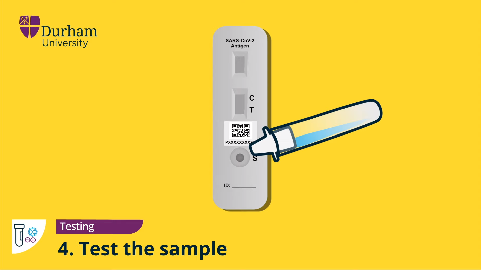
After initially meeting with someone on the Covid testing project team to understand the needs of the project, we were given some material from Innova and Public Health England that described how the test works. Another member of the digital learning team was able to go to the University to collect a test kit and take reference photos of the various components. We decided that it would be easier to create an animation demonstrating its use than to record an accurate video given the constraints of time, equipment and distance. This choice also facilitated easy changes should the processes change (which they did a few times), whereas a video may have needed to be re-shot, it was simpler to amend and rework animations.
My development colleague worked out a process and script for the video, but unfortunately was then unable to continue helping with the project.
I had begun working on some illustrations of the various components involved while the script was being prepared, so by the time the script had been double checked with experts from Public Health England, I was able to start piecing together images into a rough animation draft.
Design
The design – primary colours, fonts, and icon styles were adopted from the University’s existing Covid-19 materials, and a number of vector files were provided so that I could reuse some of these elements. The remainder of the icon-based graphics echoed this style so that the video would fit in with the overall information campaign.
Additional graphic elements were designed with clarity and accuracy in mind. It was considered important that the main elements of the kit would look as close to the real items as possible to avoid confusion, so these were drawn as accurately as possible. This combination of low- and high-fidelity graphics means that more time and effort could be expended on the more important imagery.


Animation
I used Adobe After Effects to do all the animation, and a combination of Adobe Illustrator and Affinity Designer to make the illustrations.
The overall animation is comprised of a series of discrete comps that fit into one master comp which contains the whole video timeline. This structure provides:
- A much easier editing process for corrections and minor tweaks since it’s easier to move whole comps along the main comp’s timeline
- A nice way of animating and manipulating whole comps, for example, fading them in, sliding in and out of frame etc.
- Looping animations, such as the rotating animation at the beginning
Draft 1
When the script was finalised and approved, I asked a friend with a truly great voice to do the narration for me. Once this was edited together, I had a rough length of video to work with and it came out at close to 7 minutes!
I started by creating a master comp and a series of sub-comps, splitting the audio into each comp and adding the static graphics and pieces of animation I had finished before the final script was ready. In doing so, I was able to rough out a full-length video quite quickly.

Draft 2
The second draft has more detailed animation when introducing the test kit, though this is clearly not finished yet. Many sections still contain placeholder graphics and not much animation.
From here on out, I took each section one at a time and completed a more detailed animation treatment on each one.
There’s no way I would have been able to do such a decent job in the time scale without using some nice animation plugins from Mister Horse. Life saver!
Draft 3
Nearly there at this point…the animations are pretty much all in now. Some script changes have come in, which meant making some extra audio recordings and integrating them. I was less happy with this because the new recordings had different background qualities and it was really hard to match them to the sound quality of the first set of audio recordings. Having a FINAL script is definitely ideal before recording, but it was a bit of a rush to get this out.
With the changes made and paying a lot of attention to trimming and pacing the animations, I was able to cut the length down significantly.
Draft 4
This version finesses some of the liquid movements by actually animating them. I used the puppet tool in AE for this.
This final draft concentrated on finding visual and scaling errors such as animations crossing over the main logo.
For the final version, I boosted the audio and improved the graphics for the test kit box in the final scene.
Good practice points
For this project, I largely relied on prior experience in producing multimedia learning – drawing particularly on Clark & Mayer’s multimedia design principles (2011). In particular:
- Modality – using audio with imagery, but largely avoiding use of both text and audio except where justified for emphasis.
- Segmenting – splitting the content up into clear sections to avoid overloading the learner’s ability to process the content
- Personalisation – addressing the learner directly using natural speech and ‘you’ where appropriate
- Contiguity – animating the actions as the speech progresses, having items appear as they are mentioned, and keeping text labels in close proximity to the relevant graphics
- Redundancy and coherence – keeping it simple and pared back to only what is needed. Minimal branding and ‘extraneous’ material. The only thing that really violates this I think is the background music. This was used to remain in keeping with the rest of the University’s material, but was audio balanced to make it less obtrusive, and is ducked under the speech. Additional text for emphasis is used sparingly. Subtitles were provided as an optional element for those who need them rather than making an unwelcome distraction for all users by baking them into the video.
References
Clark, Ruth Colvin., and Mayer, Richard E. E-learning and the Science of Instruction : Proven Guidelines for Consumers and Designers of Multimedia Learning. 3rd ed. San Francisco, CA: Pfeiffer, 2011. Web.